Blog
Bold Typography: Unleash Stunning Print Design Inspiration Today

Bold Typography: the gateway to unparalleled print design inspiration today. In a rapidly evolving world of design that spotlights minimalism and simplicity, bold typography stands out as a refreshing game changer. It’s the paragon of innovation, empowering designers with amazing creative choices. This creative stratagem can spruce up visual appeal, inject a layer of emphasis, and refine a design’s overall feel. In this article, we delve into the depth of bold typography, and how it is poised to redefine the future of print design.
Bold Typography: The New Normal in Design
Bold typography is no longer just an occasional strategy to emphasize certain pieces of content. It has rapidly evolved into a mainstream approach, packing an extra punch to digital designs. Its adoption is spreading across various design fields, including web design, print media, and advertising, among other areas.
There are several reasons why bold typography is enjoying such unparalleled recognition. Firstly, it’s the perfect tool to grab attention. When someone chances upon a design, the first thing they notice is the typography. If it’s bold, it’s sure to capture their interest immediately.
Additionally, typography carries incredible power to convey emotions and set tone. The selection of the typeface, weight, size, and even kerning can influence the message the design sends out. Bold typography, therefore, not just capture attention but helps establish the mood and communicate the message more artfully.
Using Bold Typography for Print Design
When using bold typography in your print designs, you must align it with the overall design theme. The choice of fonts and the way they’re utilized should merge seamlessly with other design elements. Here are a few tips on how to use bold typography to your print design’s advantage.
1. Use Bold Typography for Titles: Titles and headers are the top spots to use bold typography. It’s a natural emphasis creator. A bold title divides the content into readable chunks while capturing the viewer’s attention.
2. Balance is Key: While bold typography is eye-catching, using it excessively might make the design overwhelming. It’s necessary to strike a balance between using standout bold fonts and standard typefaces to maintain legibility.
3. Colour and Contrast: Colour always plays a vital role in any design. A well-executed interplay of contrasting or complementary colours can enhance bold typography’s visual expression.
Bold Typography: The Gamechanger in Print Design Inspiration
Bold typography broadens the horizons of print design inspiration. For instance, it can transform a typical poster into a piece of art or turn a book cover into an engaging spectacle.
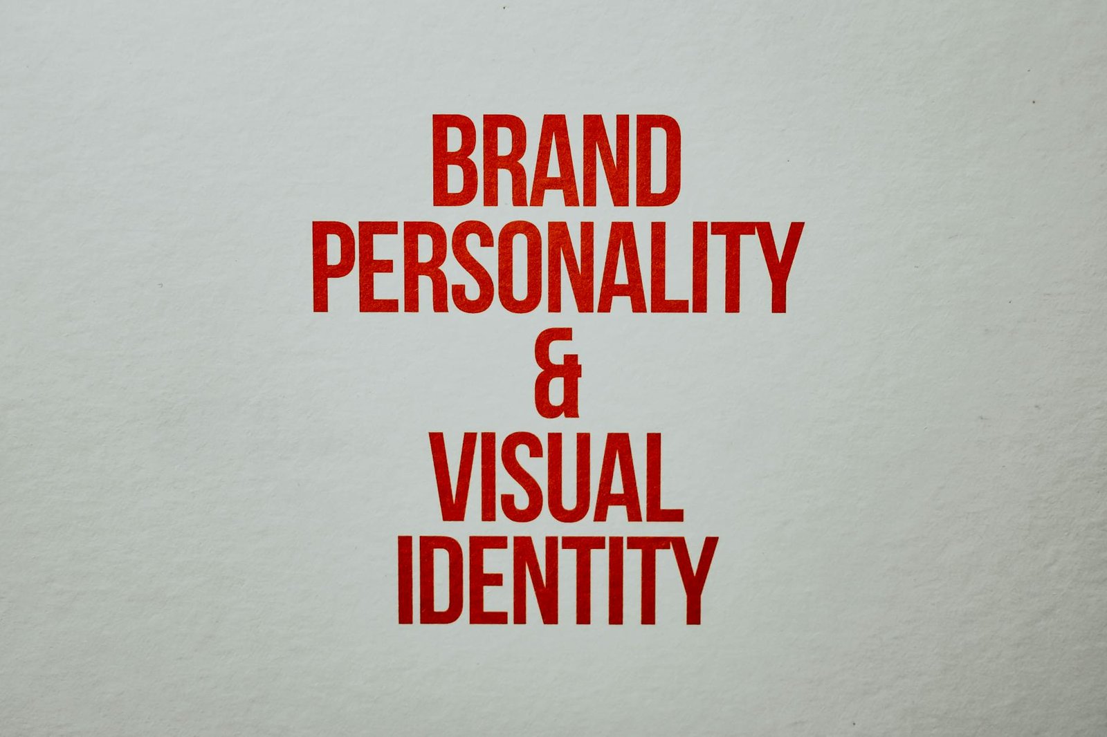
One main advantage is its ability to create hierarchy and order. A design featuring bold typography guides the viewer’s eyes where you want them to go. Additionally, bold typography speaks volumes about a brand’s personality, making it an effective tool in advertising and branding.
In conclusion, bold typography is setting a new benchmark in print design. Its propensity to emphasize, captivate, and elicit emotions widens the scope of creativity. As a designer, embracing bold typography could be your ticket to pushing the envelope of design possibilities. With a mix of artful creativity and wise decision-making, you can transform your print designs into inspiring pieces of work.


